Duracell Direct is an e-commerce retailer operating as an official licensee of the Duracell brand. The site specialises in supplying genuine Duracell batteries, camera and laptop chargers as well as power banks and smartphone charging accessories, helping customers quickly and confidently find the correct power solution for their devices. The website plays a key role in communicating product reliability, making its usability and overall experience central to customer confidence and conversion. In this project, I redesigned the website with a modern, fresh look that reflects their innovative products and core values of trustworthiness.
duracell direct
ux/ui web design project
Problem
Duracell Direct is officially licensed by Duracell, but its website doesn’t really show their values, like trust, simplicity, or how reliable their products are. It can be hard for users to find the right categories or products, and they might not be sure if the site is legit. The design feels outdated and cluttered, making it tough to use and less likely for people to make a purchase.
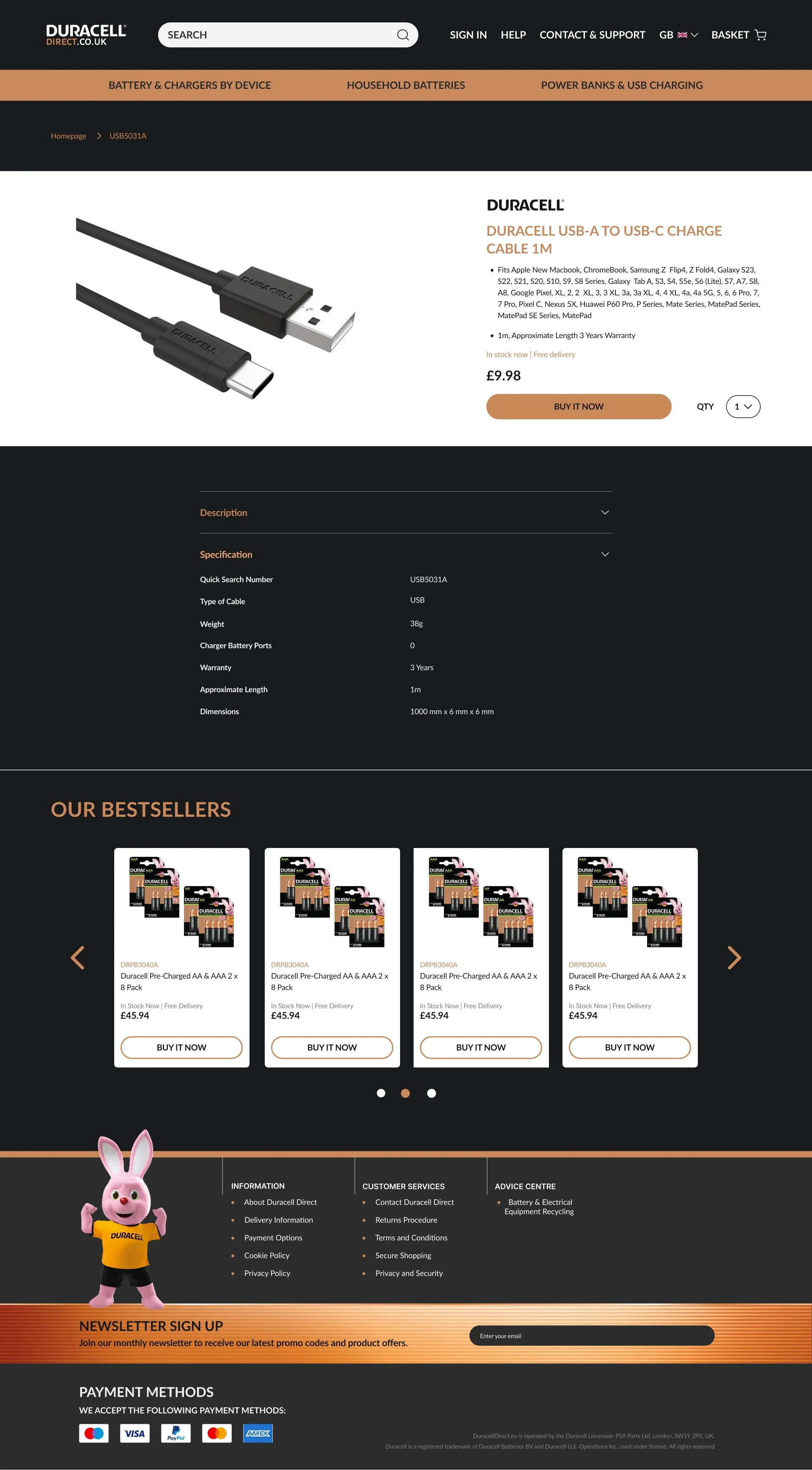
Duracell want this site to align more with their design system. We want darker backgrounds, premium photography and extended content added to PDPs.
goals
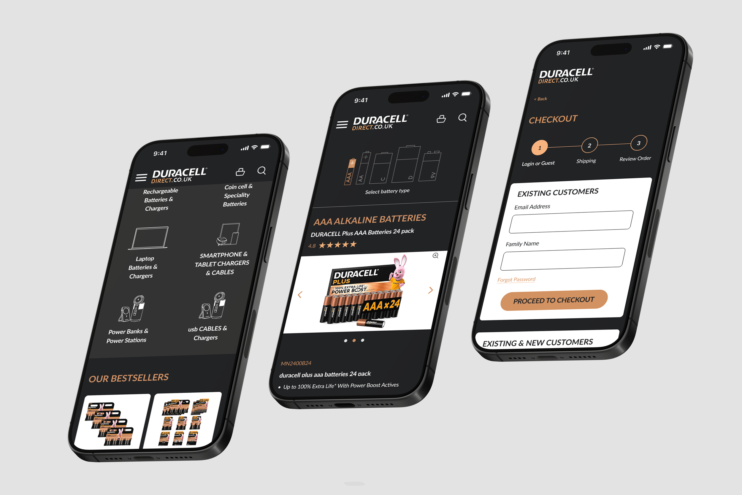
Build a straightforward, up-to-date, and reliable online shopping experience that lets users quickly find and buy the right power solution for their device. The new site should boost trust, make it easier to use and navigate, and show Duracell Direct as a trusted, official place for Duracell products. The look and feel should also be more in line with Duracell.com and in keeping with their dark backgrounds and copper accents
SOLUTION
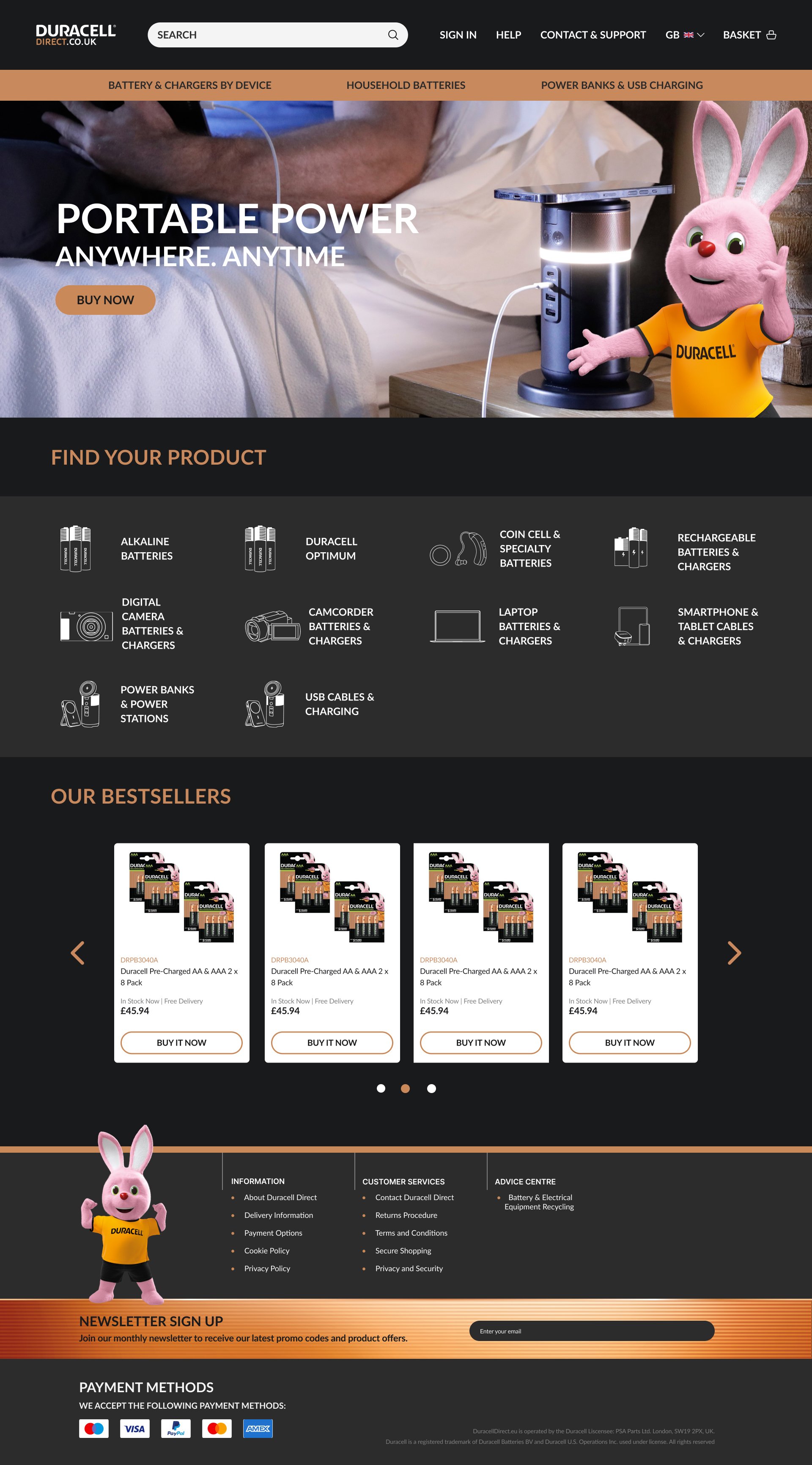
before
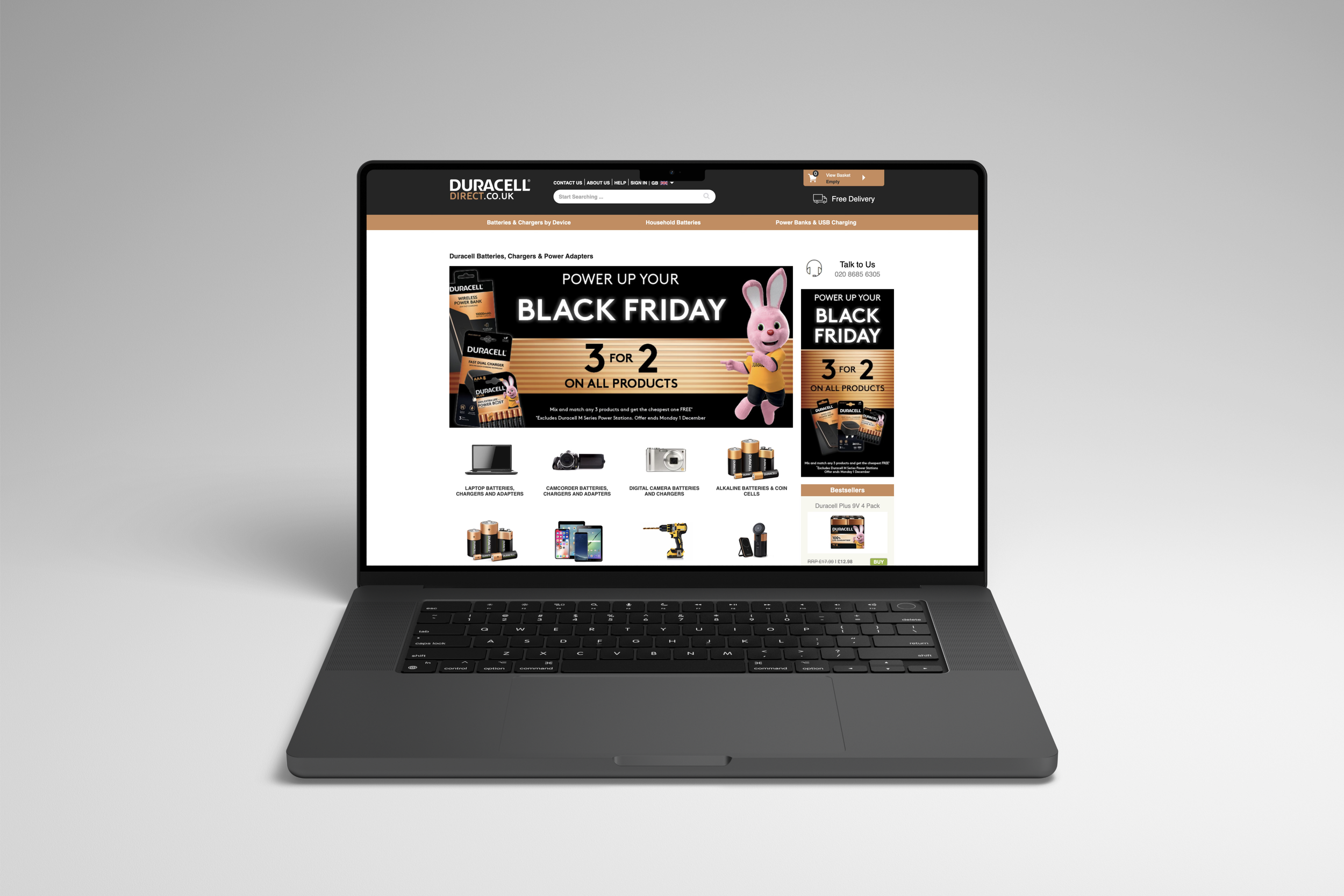
Outdated photography used in homepage navigation
Doesn’t align with the Duracell.com site
Inconsistent typography and layout
Text does not comply with accessibility guidelines
Call-to-action lozenges are weak and unclear
after
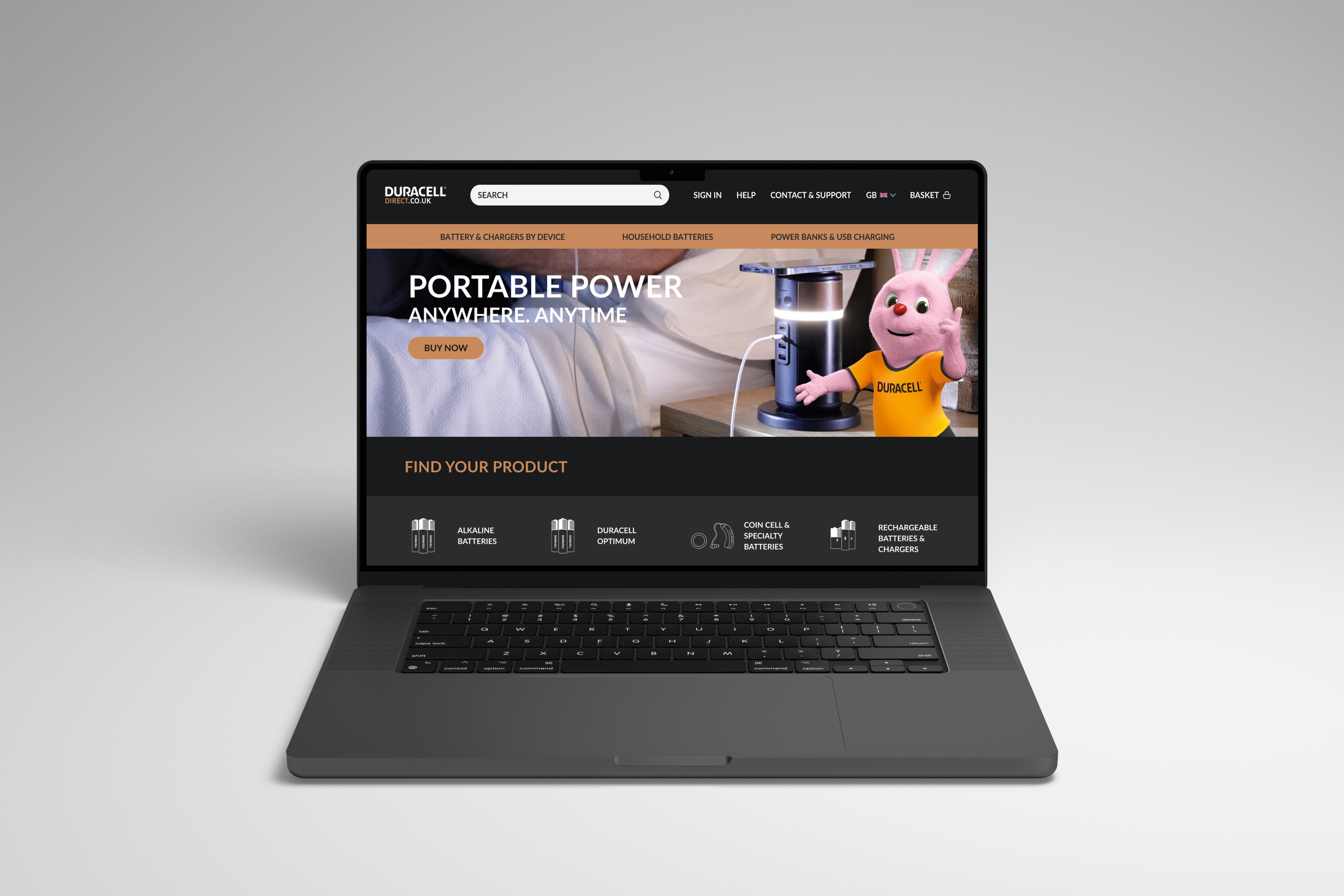
Up-to-date and modern illustrations with a clear hierarchy
Now uses a dark background to align with the Duracell.com design
Uses a clear design system for consistency across all pages
WCAG AA colour-compliant colour contrast
Clear call to actions that stand out